Hiver.Digital was planning for a solution which is a fare calculation app that let a user compare transport fare between 15+ providers in Bangladesh. This app will ease the users' pain to switch between Uber, Lyft, Pathao, Shohoz and other ride-sharing apps to know the cheapest option for their ride. I’m one of the co-founders of this solution. The goal of this design project was to design a personalized and easy to use mobile and web application.
In the 1st Year
Review
In Bangladesh
International Award
Vara koto is a fare calculation app that let a user compare transport fare between 15+ providers in Bangladesh. It also lets users know promo codes, bus route information, train fare and schedule, rickshaw fare, inter-district bus fare and more. Learn more about what Vara Koto does.
I co-founded Vara Koto in 2016 and acting as a product designer since then. We have 1 developer and 2 business experts. I'm supporting design across every aspect of our business and am responsible for leading UX and UI across key parts of the application side of the platform.
Here are some key achievements that I've gained in the last couple of years.
I follow these 6 stages to design process to sort out the design goals and implementation. You can learn more about each of the processes here. By the way, this article was also written by me during one of my copywriting projects with UXPin.

Right now, 15+ ride-sharing providers are operating in Bangladesh. Uber,
Pathao, Shohoz are some of the popular ones. They offer different fares
for different services. If a user wants to go from point A to point B,
he needs to check all the apps one by one to get the cheapest option.
Public transportation is another story. Riding on local transport here
in Dhaka is like winning a battle for the city dwellers! But it is not
the end of the story; it is just the beginning! Because the war starts
later on whenever they are to pay their transport fare!
Several public transportation services are available in the city, e.g.
Local Bus,Taxi, CNG, Tempo, etc. A Government fixed fare policy is also
available for all the transportation modes. But unfortunately, you will
not get anyone charging according to that. They charge whatever they
want!
During our initial market research, we listed the following problems of our users.
I started my research by interviewing potential users about their problems. I tried to pinpoint their challenges and the difficulties while using public transport. The key findings of my 15 days of research are below:
With the data gathered from market research, I started to generate provisional personas using statistical knowledge. These represent a certain type of user that is the potential audience of our solution. These personas will help me screen appropriate people to interview.
Frequent Public
Transport User
Age 20-30 | Android Smartphone User | Use public transport for work commute
Pain Points:
Frequent Ride
Sharing Service User
Age 20-30 | Android Smartphone User | Use public transport for work commute
Pain Points:
Frequent
Rickshaw User
Age 19-50 | Android Smartphone User
Pain Points:
With research data in hand, We decided to build an Android app and web application. That will let the user input starting location and destination location, and then it will automatically calculate the fare of different service providers. Users will be able to compare the fare from one screen. Also, the user will be able to launch different service provider app directly from our solution.


I created a comprehensive design system for a solution. That includes different typography, icons, cards, modals, and other UI elements. One of my base design frameworks was Google's material design. The initial design system took two weeks to create.


After five weeks of design, iteration and experimenting, we finally start implementing our design to product development. I worked closely with engineers to develop the designs for MVP. I scoped out tickets for the front-end engineers with user stories and product requirements. I also encouraged the team to look into the clickable prototype to quicken the implementation process and worry less about the component interactions.

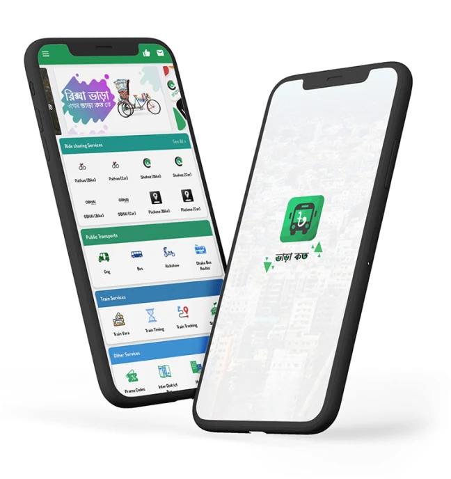
Splash screen and
Home screen

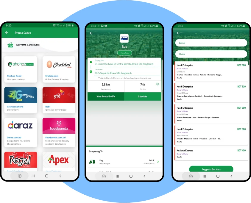
Promo codes , Fare Calculation,
Inter-district bus fare

Web Application
https://varakoto.web.app

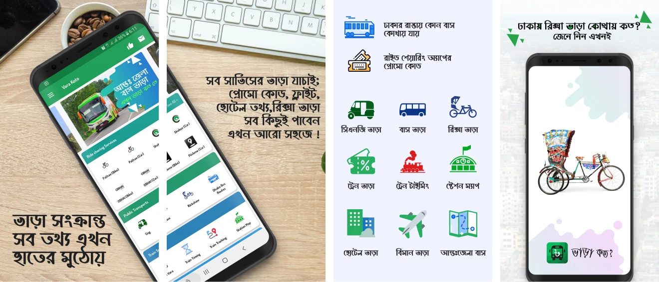
Google Play Store Screenshots


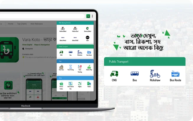
Vara Koto Chrome Extension
Working in an early-stage startup was a challenging experience. It taught me a lot about being lean and knowing when and where to focus your energy and efforts.
Some key takeaways from this project are: