Chronic pain is long-standing pain that persists beyond the usual recovery period or occurs along with a chronic health condition, such as arthritis. Chronic pain may be "on" and "off" or continuous. It may affect people to the point that they can't work, eat properly, take part in physical activity, or enjoy life. At least 10% of the world’s population is affected by chronic pain and it costs up to $1265 billion every year globally. Since its inception, ManagingLife LLC is on a mission to lower the human and financial cost of chronic pain with our clinically-validated digital solution, Manage My Pain.
We wanted to make a solution that is a clinically-validated digital health solution, It will help people with chronic pain and their providers to measure, monitor and manage their symptoms to execute the treatment. We also wanted the solution to be a commercially-available digital chronic pain treatment companion with clinical validation of improving patient outcomes. Our primary goals were to build a solution that:
In this case study, I will walk you through the design process of the “For Patients” app ManageMyPain.

I followed these 6 stages to research process to better understand our target users, problems, possible solutions and improvement opportunities.

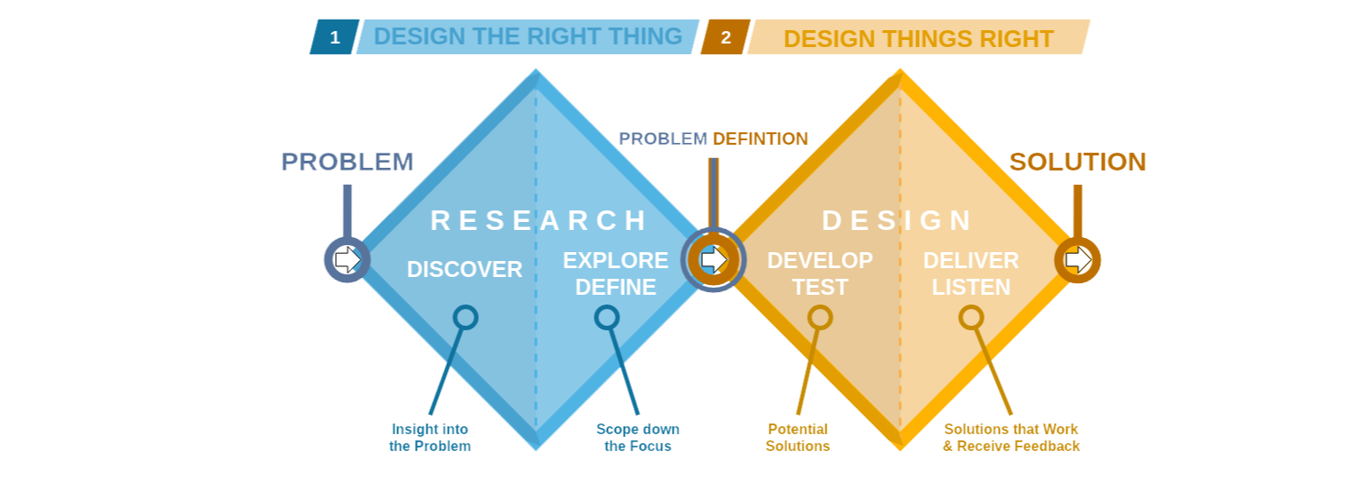
Throughout the design process and design thinking, we followed the “Double Diamond” process methodology to better understand the problem and discover the best possible solution for our target users. The Double Diamond is a visual representation of the design and innovation process. It's a simple way to describe the steps taken in any design and innovation project, irrespective of the methods and tools used. The Double Diamond model has four stages: Discovery, Definition, Development and Delivery. Together, these stages work as a map designers can use to organize their thoughts in order to improve the creative process.
Liz has fibromyalgia and suffers from chronic pain. She feels that no
one understands her condition and her doctor's questions can be
confusing and overwhelming. Keeping a pain diary might help but it's
time-consuming and there are too much information to get anything
meaningful from it. She needs an easier way to document her pain to
better manage it. She needs an effective way to track analyze and share
her pain. It will give her a common language to describe her pain in a
way that both she and her doctor understands. And she will also need a
clinically valid report that her doctors can use to treat her pain.
During our initial market research, we summarised the following problems
of our users.
In this phase we focused to dig deeper to identify target users and their pain points.
We formatted our user interviews sessions with 4 categories of questions:
We have also done some field studies to better understand our target users. We wanted to explore what they do and how they communicate with doctors. Here are some key things we have done during field studies.
With the data gathered from previous research, we started to generate provisional personas using statistical knowledge. These represent a certain type of user that is the potential audience of our solution. These personas will help us to fine-tune our design for target users.
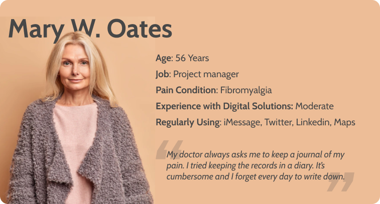
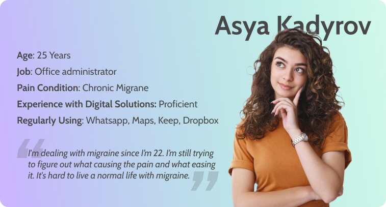
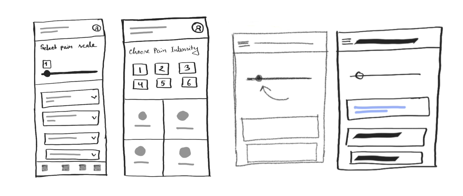
With research data in hand, We decided to build the prototypes. As we iterate with the design thinking process, we build different prototypes for different user journeys and happy paths. Here are some of them.
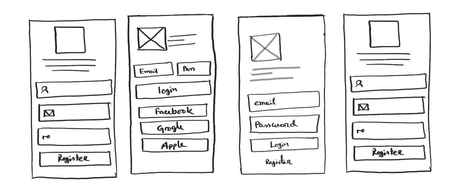
With a visual prototype in hand, we are now ready to do some testing. We run a series of Usability Testing and User Acceptance Testing (UAT) for a week with our potential users. Here are some tools we used for testing throughout our design process.

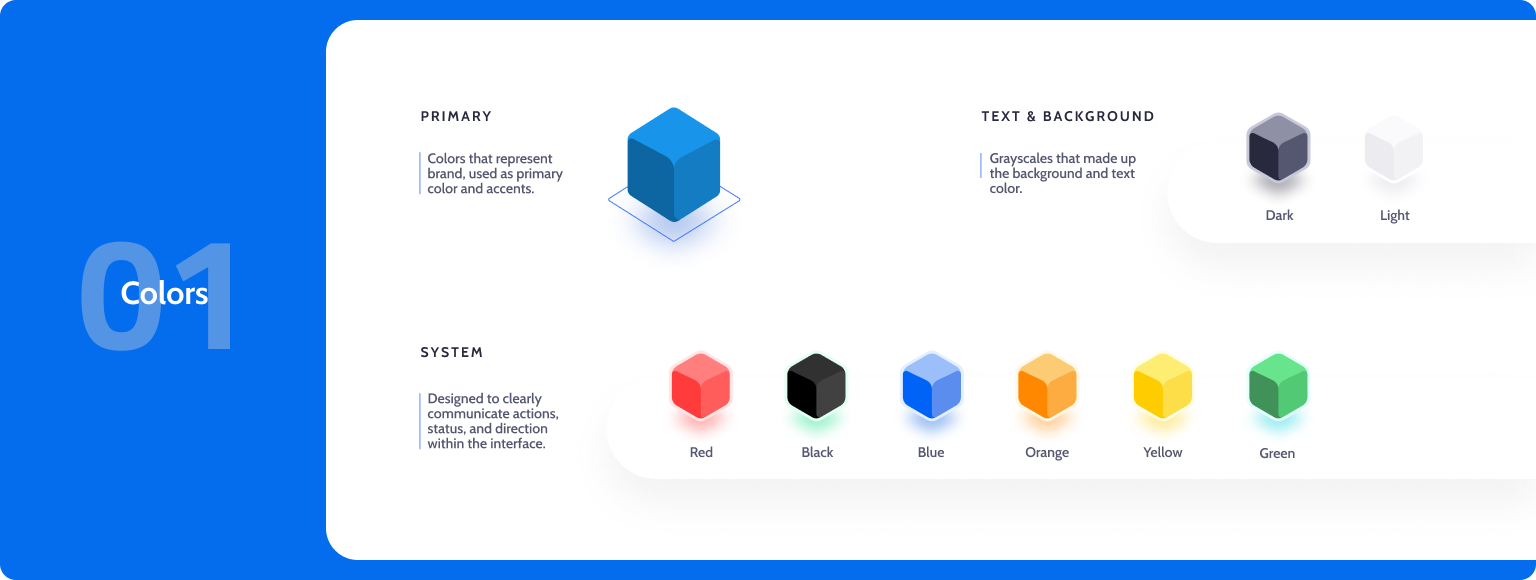
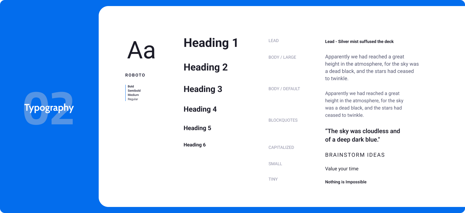
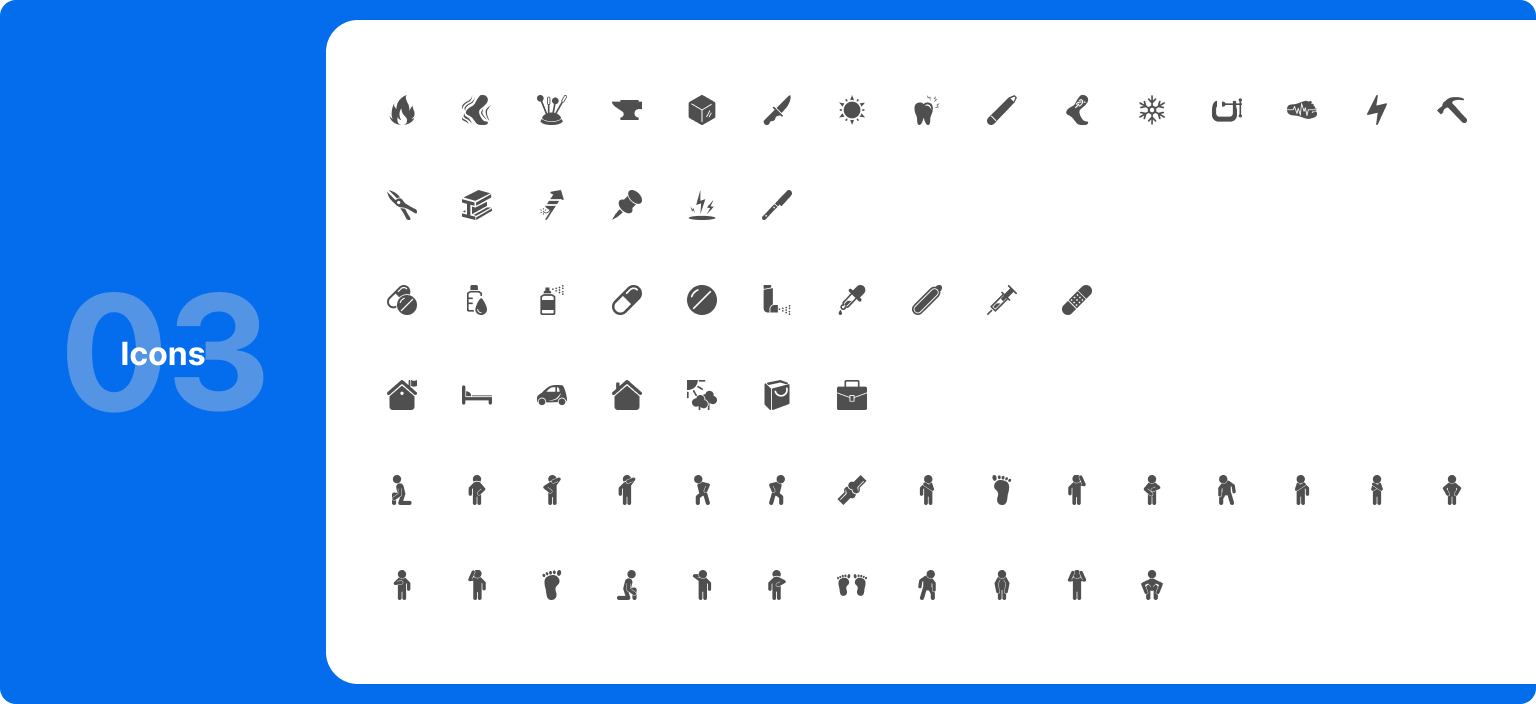
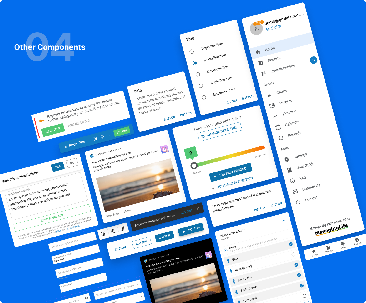
We created a comprehensive design system for the solution. That includes different typography, icons, cards, modals, and other UI elements. One of our base design frameworks was Google's material design. The initial design system took two weeks to create.
After five weeks of design, iteration and experimenting, we finally start implementing our design to product development. I worked closely with engineers to develop the designs for MVP. I scoped out tickets for the front-end engineers with user stories and product requirements. I also encouraged the team to look into the clickable prototype to quicken the implementation process and worry less about the component interactions.
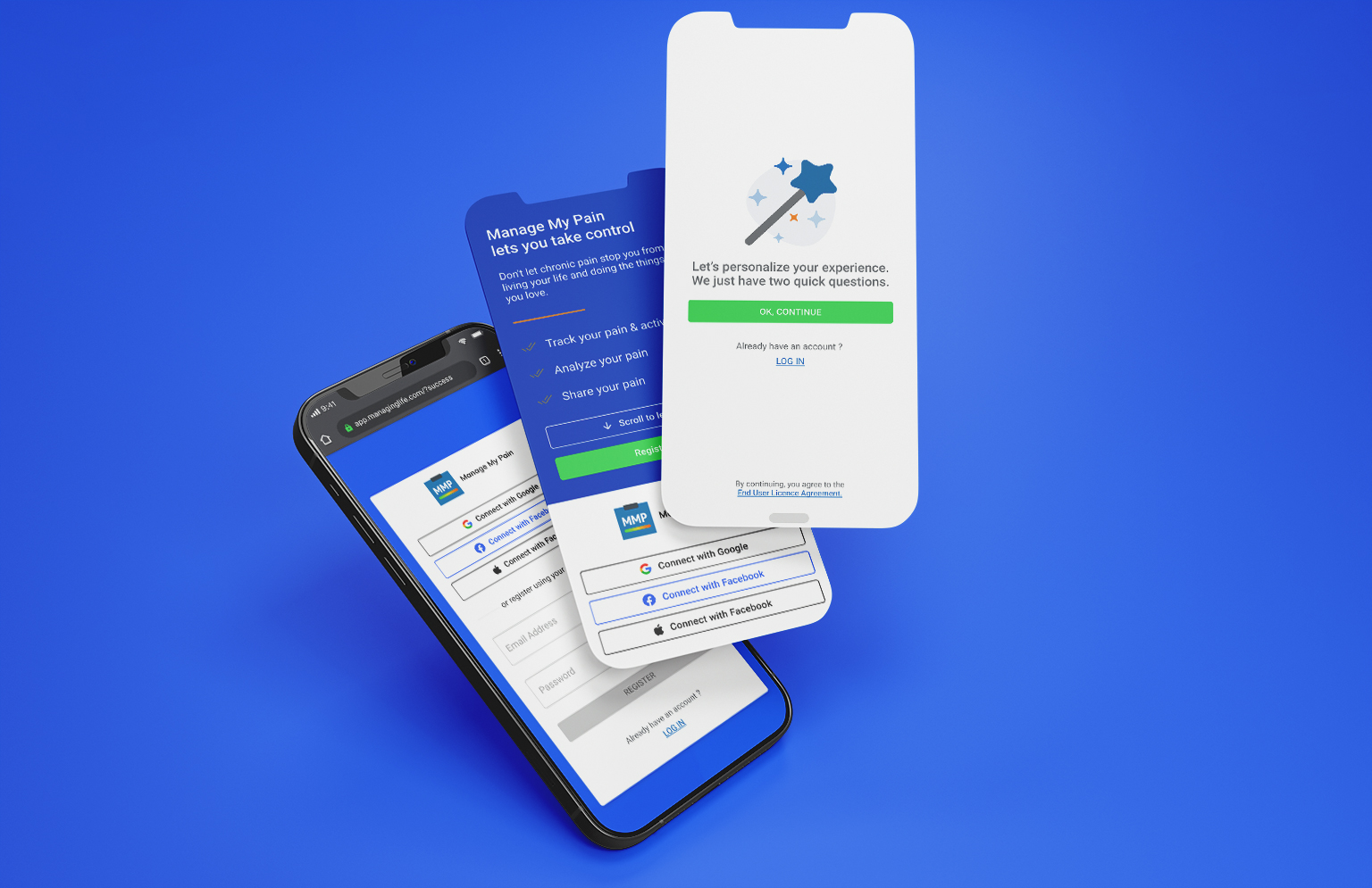
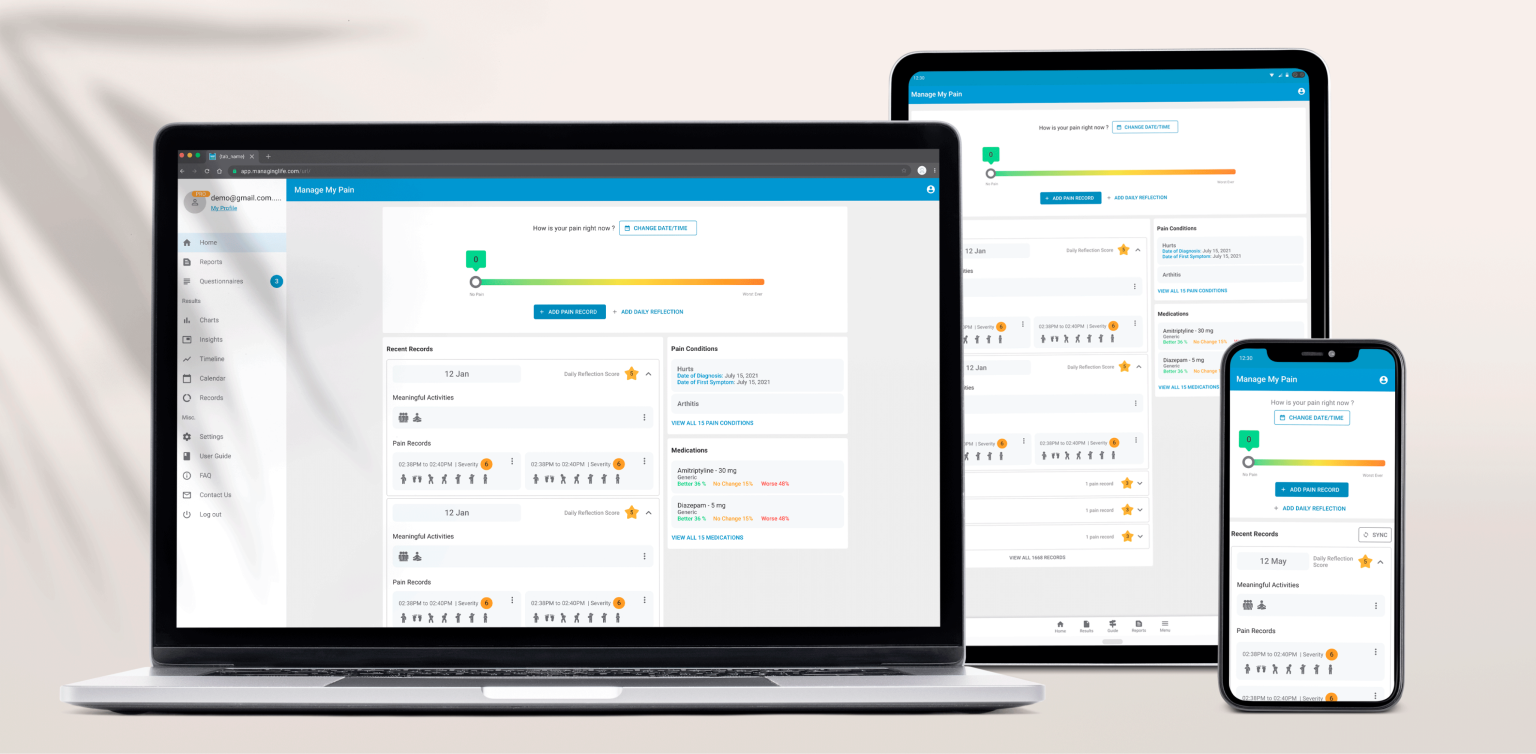
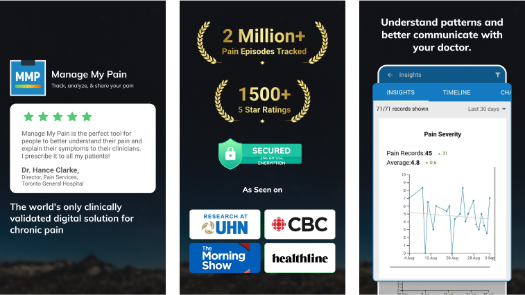
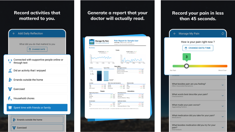
Working with a healthcare product was a challenging experience. It taught me a lot about knowing when and where to focus your energy and efforts. Some key takeaways from this project are: