
Solo, end-to-end delivery
One person across product, design, and engineering. That isn't a constraint to apologize for — it forced systems thinking, because every shortcut would be paid for by the same person at 2am.
Product design & engineering case study · Travel
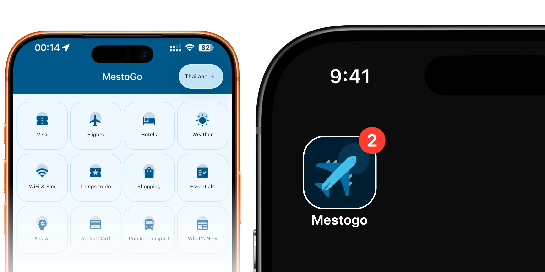
MestoGo is a country-aware travel companion for the practical moments around a trip — what to prepare, how to arrive, where to find live flight context, and how to get around with more confidence. I conceived the product, shaped the strategy and experience, and built the live iOS, Android, and web app end to end. Not just the design — the shipping software.
01 · The opportunity
A traveller arriving in Bangkok may need an arrival card, a live flight update, a fair tuk-tuk price, an eSIM, and an embassy number — often while moving, in an unfamiliar place, on patchy data, in a script they can't read. The information exists. It is scattered across government sites, booking services, maps, blogs, and a dozen group chats, and none of it tells you what to do next.
That reframing set the bar for every feature. The central product question for MestoGo was not “how do we make a bigger travel guide?” It was: how do we help someone take the right next action at a moment of uncertainty? A feature earned its place only if it was useful in a specific travel moment, honest about what it could and couldn't do, and local enough to deserve space on a traveller's phone.
That mattered for users because uncertainty — not ignorance — is the thing that makes travel feel hard. And it mattered for the business because a product that earns a place at the anxious moments is the one people keep installed.
02 · Constraints that shaped the work
A modern travel and mobility product lives at the intersection of travelers, governments, networks, and money. The interesting work is in reconciling them, not pretending they don't exist.
One person across product, design, and engineering. That isn't a constraint to apologize for — it forced systems thinking, because every shortcut would be paid for by the same person at 2am.
iOS, Android, and web from a shared React Native codebase. Consistency had to be a property of the system, not the result of three teams trying hard.
Travellers on roaming data, unfamiliar scripts, and mid-range Android devices. The product had to stay useful as it degraded — offline-first habits and local caching were survival, not polish.
LLM calls cost money and fail. AI features had to be rate-limited, remotely configurable, and provider-portable — never a single point of failure for the core experience.
Visas, arrival cards, and fares are moments where bad information costs real money or a missed flight. The design had to be honest about certainty — no false precision, no vague promises.
Fares change, models change, APIs rotate keys. Configuration that would otherwise need an app review had to live in the database — remote control was a launch constraint, not a nice-to-have.
03 · Scope & ownership
I identified the core traveller problems, set what MestoGo should stand for, chose the initial destination model, and kept the feature set tied to real travel jobs rather than generic content.
Information architecture, country switching, the visual language, a dual-layer design system (Tailwind utilities plus a typed token layer), content hierarchy, and the app-store presence.
A cross-platform React Native app — multi-region navigation, the Firebase backend, the AI services, the fare engine, monetization, and analytics. Real software, not a clickable prototype.
I treated launch as the start. Maintenance, improvements, evolving coverage, and deciding — from real signal — which areas deserve more depth.
Stack, for the skeptical: React Native & Expo Router, TypeScript, Firebase (Auth, Firestore, Analytics), Microsoft Clarity, Google AdMob, NativeWind, a custom design-token system. The product is live on the App Store
04 · Product approach
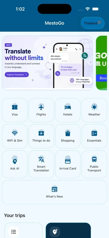
The home dashboard gives each destination a familiar starting point. From there, help is grouped into a handful of legible travel moments: prepare, move, navigate locally, and communicate. A traveller never has to learn the company's internal org chart to find the thing they need right now.
Prepare
Visas and arrival-card guidance before travel becomes time-critical.
Move
Airport context, live flight status, schedules, and fare discovery in one surface.
Navigate locally
Transport, connectivity, weather, essentials, and safety once you're past the airport.
Communicate & adapt
Smart translation and trip-aware checklists for the immediate question or the personal plan.
05 · The TukTuk fare calculator
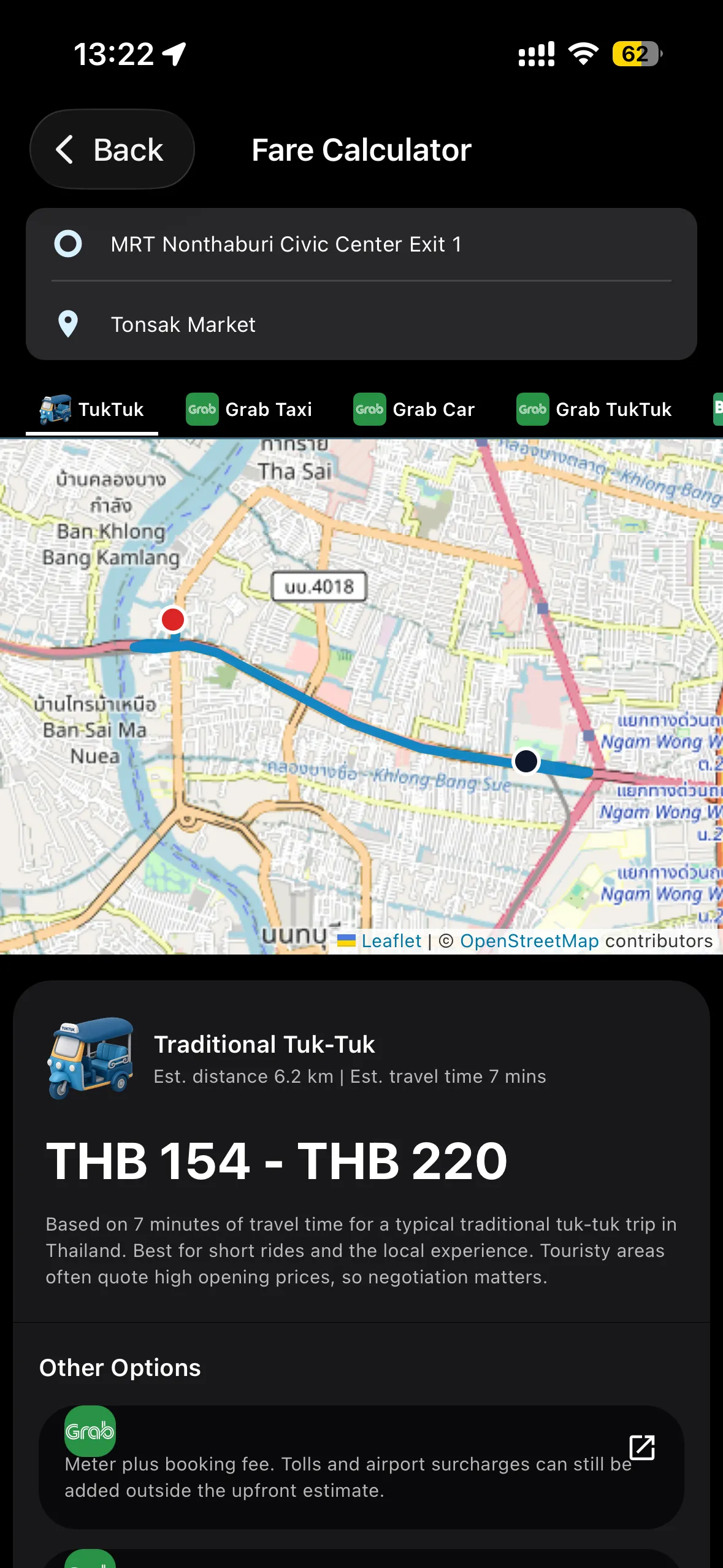
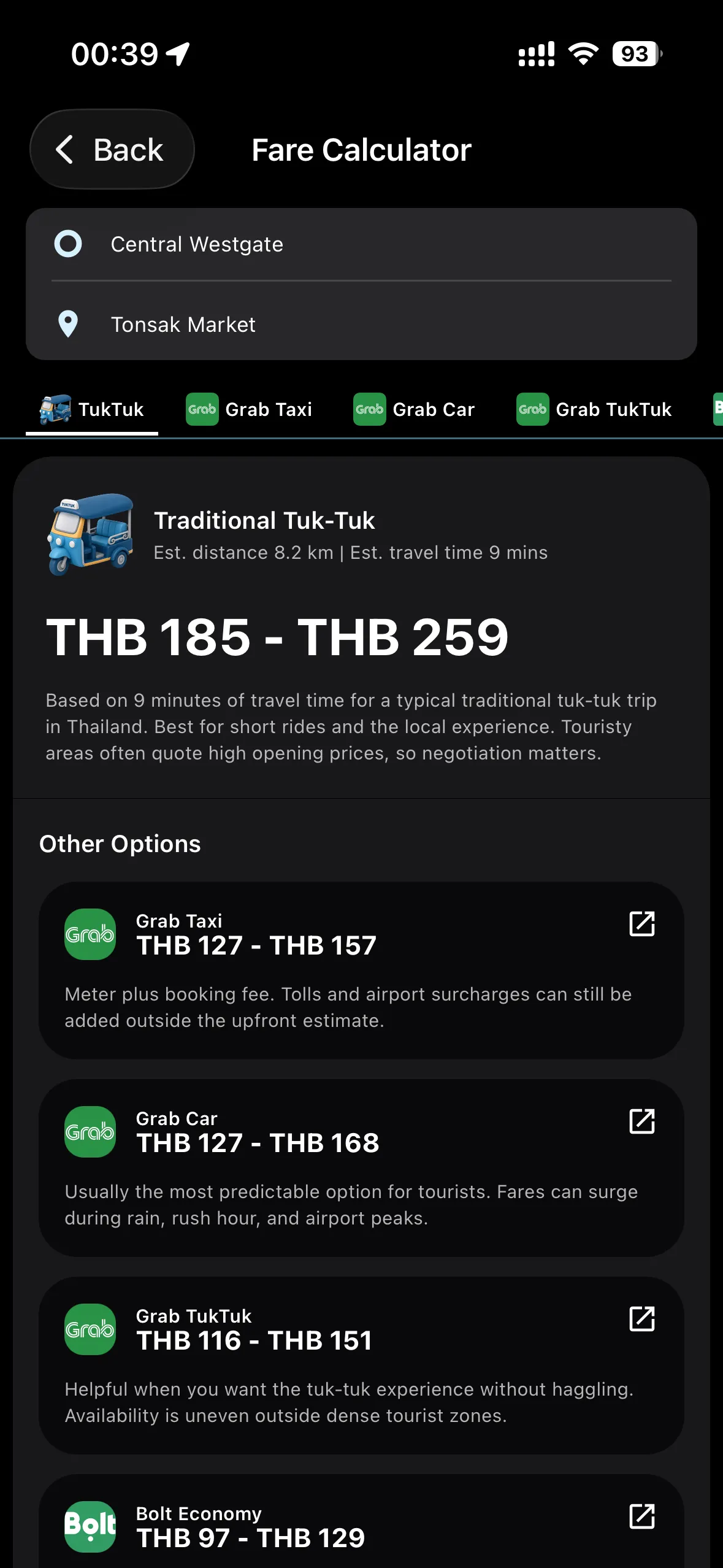
Tourists get overcharged because they don't know the fair price. The obvious answer is a fare calculator. The interesting work is everything after “calculator” — and that work is half judgment, half engineering.
Decision 1 · Judgment
A street fare is not fixed. So the calculator returns a minimum–maximum range, explains why negotiation still matters, and places traditional tuk-tuks beside Grab and Bolt so the traveller sees the real trade-offs. The alternatives I considered — a single confident number, or no estimate at all — were both dishonest in different directions. Honesty over false precision.
Decision 2 · Engineering
I built a general fare-estimation engine. Pricing lives in a database, not the code, so fares update without an app release. It models two real pricing schemes — linear, and tiered “meter-style” bands — and applies min/max multipliers to produce the range. Per country, it just loads a different service list.
06 · Building AI into the product
The principle I designed to: use AI where it shortens the gap between uncertainty and a useful next action. Two features cleared that bar, and I engineered both — the prompts, the service layer, the rate limiting, and the fallbacks.
A focused translator for a real travel moment — asking a fare, explaining an allergy — not a blank utility. It's country-aware (Thailand targets Thai, Malaysia targets Malay, Nepal targets Nepali), keeps the original and the translation together, and expands to a large “show this to a local” view.
A generic packing list is easy to Google. This one starts from the traveller's actual trip — destination, dates, who's coming — turns a plain-language request into structured output, and writes a real, editable checklist they can check off, change, or delete. The AI response becomes a first-class object, not a one-shot reply.
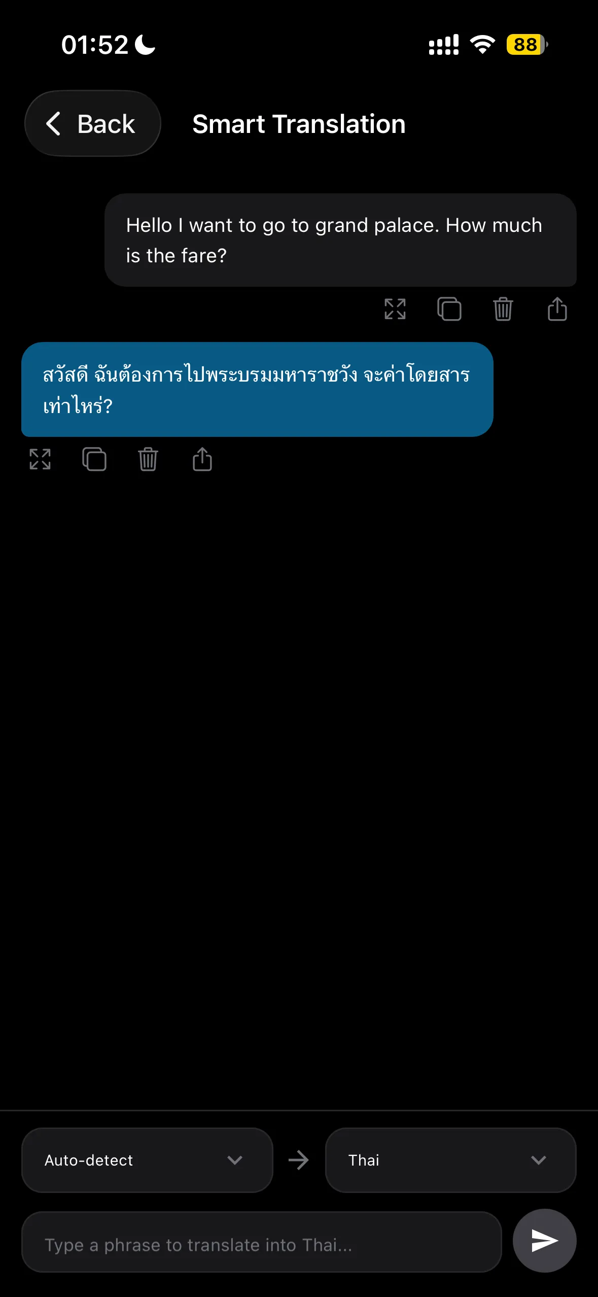
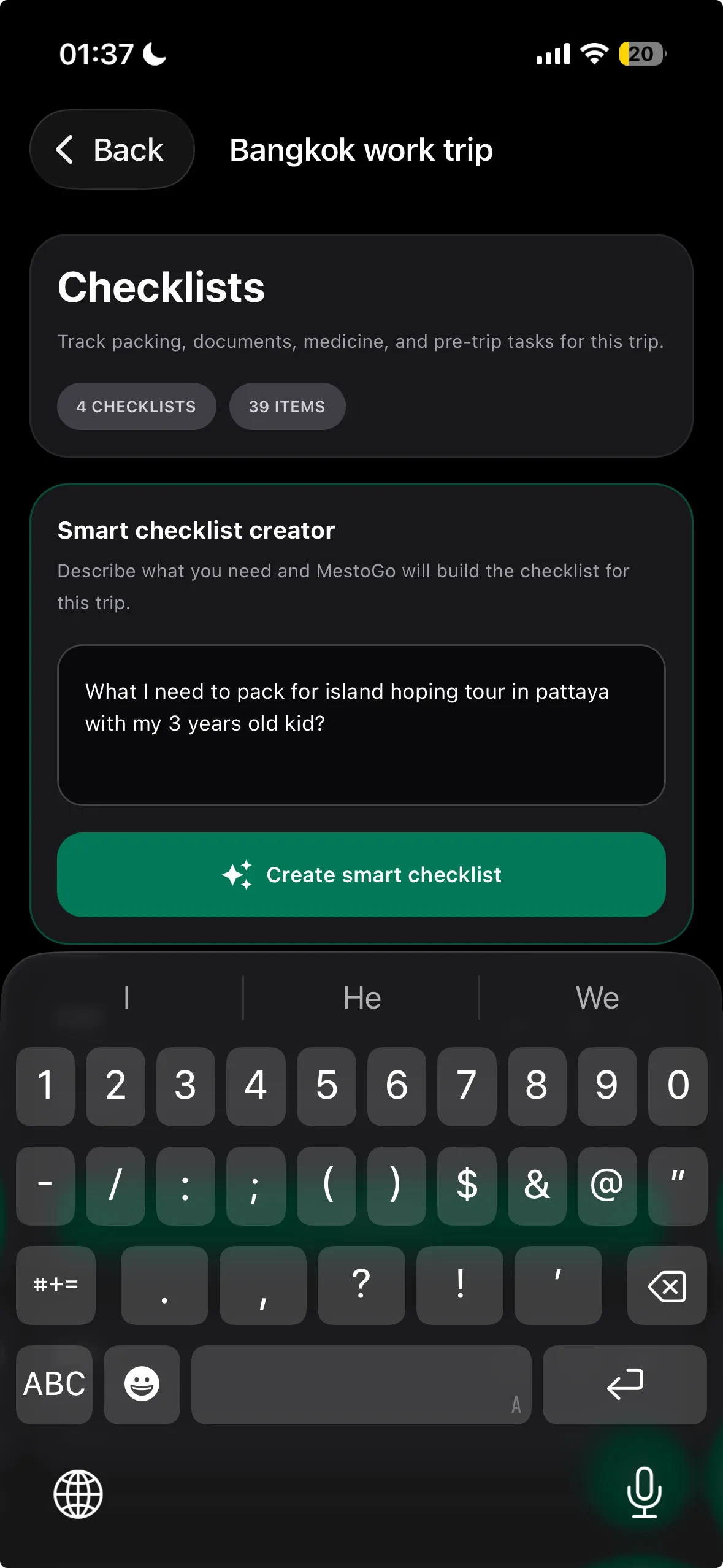
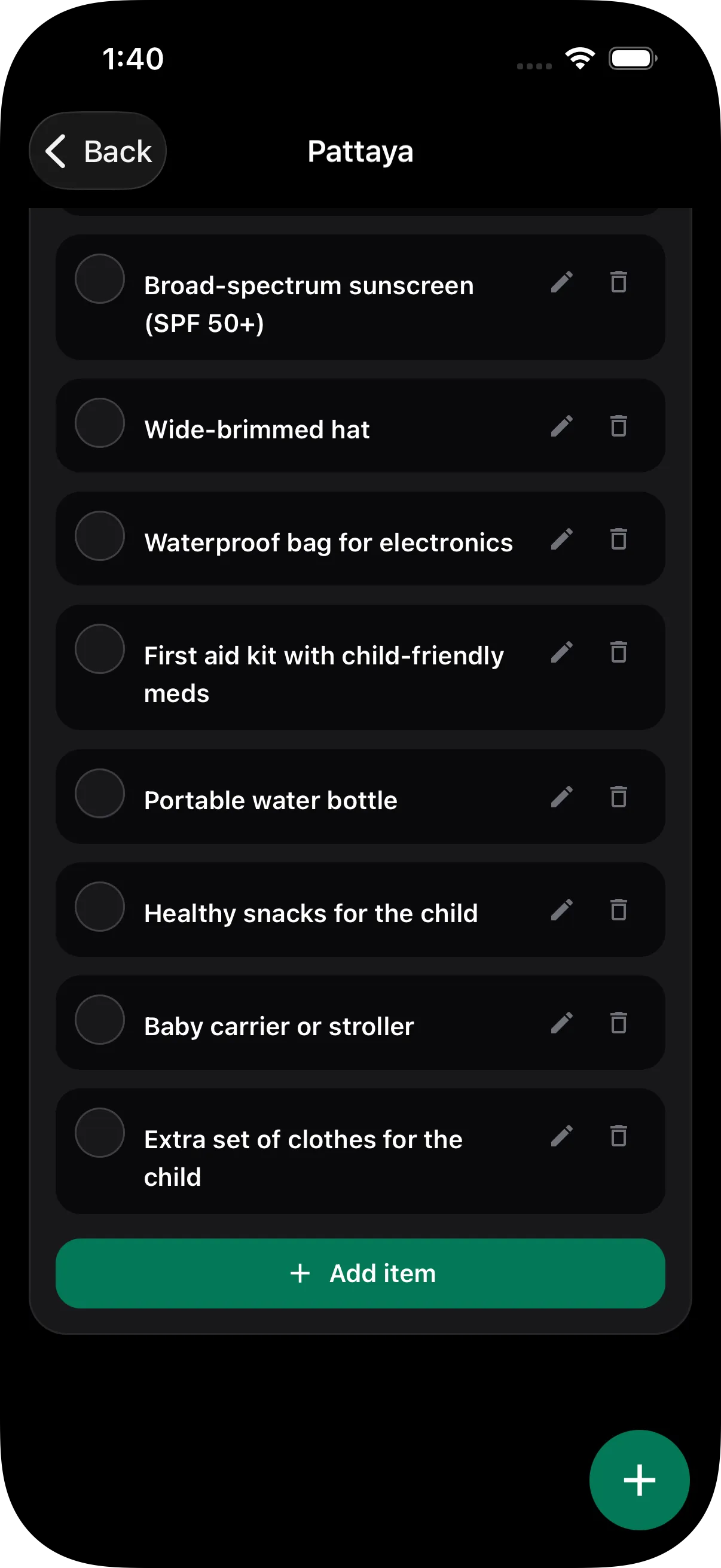
Both features share one config-driven service: provider, model, prompt, API key, temperature, and daily quotas all live in the database and load at runtime. That means I can swap the underlying model, change a prompt, or kill a feature remotely — no app release. A two-tier daily limit (soft then hard) keeps cost predictable, and the request shape is OpenAI-compatible so any provider drops in. This is the unglamorous part that decides whether an AI feature survives contact with production.
07 · Where AI accelerated my process
I used AI as a collaborator throughout, not a replacement for thinking. The shift wasn't “AI does the design now.” It was that the expensive, slow parts of the loop got faster — so I could explore more options before committing, and spend judgment where it actually matters.
Turning scattered government pages and arrival-card processes into structured, comparable steps — the raw material for the TDAC guide.
Generating and pressure-testing information-architecture options fast, so I could reject bad structures before drawing a single screen.
Drafting microcopy and localized phrasing across markets — a first pass I'd then edit for tone, accuracy, and the specific moment.
Sketching variants of a flow or screen to widen the option set before converging — more divergent thinking in less time.
Boilerplate, naming, formatting, and the mechanical scaffolding that once ate evenings — handed off so I could focus on the parts with stakes.
Drafting specs and self-critiquing decisions against alternatives — a faster way to find the holes in my own reasoning.
08 · Where AI was insufficient
The reason this matters on a product team: AI will happily produce a plausible answer to the wrong question. On MestoGo, every decision with real stakes — money, trust, architecture — stayed with me.
AI didn't decide that “next action” beat “bigger guide,” or that fares and translation deserved depth before, say, restaurant lists. That was product judgment about where uncertainty actually hurts.
AI didn't design country-switching, the config-driven model, or the decision to build a general fare engine instead of hardcoding one fare. Those were systems-thinking calls with long-tail costs.
AI didn't choose range-over-precision for fares, or provider-portability for AI features. It can list options; it can't weigh them against cost, trust, and what a tourist actually needs at a curb.
AI can't decide what success looks like, instrument the moments that matter, evaluate ambiguous signal, or stay accountable when the release is public. That's the part experienced designers are hired for.
09 · Designing for expansion
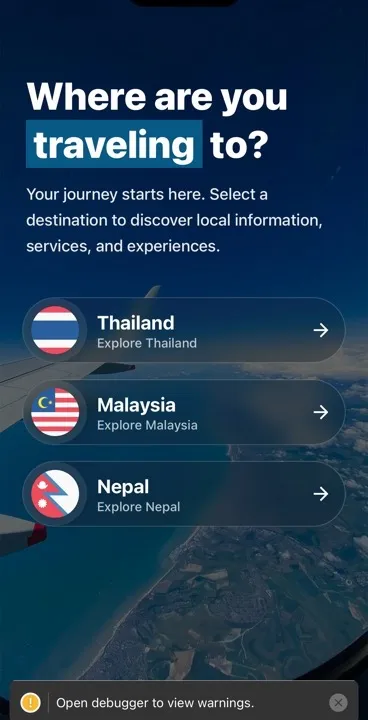
The hard part of a multi-market travel product isn't the first country — it's the third. A naive copy breaks the model; a rigid template flattens the place. I designed around three levers so depth in one market made the next one cheaper rather than a parallel rebuild.
Shared categories, navigation, and visual conventions mean a returning user understands a new destination fast.
Each market has its own entry rules, airports, transport norms, and services. Content and tools respect that reality, not a template.
Configuration lives in the database — fares, services, AI, content. Expansion means authoring data, not forking code.
10 · How I measured success
Firebase Analytics tracking screens, sessions, and journeys — plus UTM attribution so I know what brought someone in.
Dedicated tracking for the fare calculator, currency tools, and a defined “aha moment” — so value is measured by use, not opens.
Microsoft Clarity shows me where real travellers hesitate — the qualitative truth behind the quantitative counts.
A clean event taxonomy means I can run an experiment, read the result, and decide what to deepen next — without retrofitting tracking after the fact.
11 · Outcomes
I won't dress this up with numbers I can't substantiate. The honest measure of a solo, end-to-end delivery is that the product exists, is public, and is still evolving — and that the hard parts (AI, fares, multi-market) are real engineering, not mockups.
It exists, publicly
Live on the App Store across iOS, Android, and web, serving Thailand, Malaysia, and Nepal. Anyone can verify it.
It's genuinely complex
A multi-region app with a real backend, bespoke AI services, a custom fare engine, monetization, and analytics — delivered by one person.
It stays useful
The config-driven model means fares, AI, and content keep improving after launch — the work continues, exactly as a product should.
12 · Reflection
I assumed breadth would demonstrate value early. In practice, the product only earned trust at the deep, anxious moments — fares, translation, arrival cards. Shallow coverage was the easy part and the least persuasive.
How often the honest answer — a range, a “negotiate,” a clear hand-off to the official process — built more trust than a confident one. Constraint became the feature.
Build the shared content model and the moment-level instrumentation before adding markets, not after. And say no sooner to features that were impressive but served no next action.
It confirmed that owning implementation makes me a sharper designer — feasibility, cost, and honesty become design constraints in the room, not surprises later. I now assume the design isn't done until it ships.
A note on trust
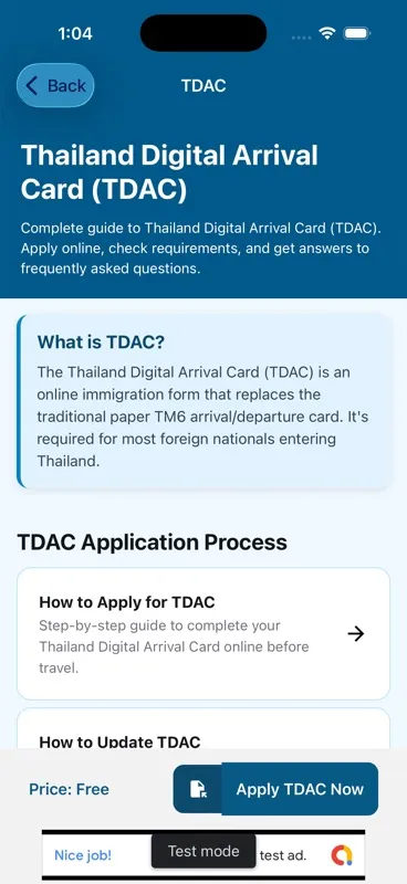
The Thailand Digital Arrival Card guide is the trust principle in miniature. A traveller needs to understand what the process is, whether it applies to them, what it costs, and where to go next. The guide turns a government process into a readable, step-by-step decision surface — then hands off cleanly to the official route. No unnecessary alarm, no vague promises, no leaving the user to decode it alone. It's the same stance the fare calculator takes: be useful, and be honest about the edges.
A note on the in-transit moment
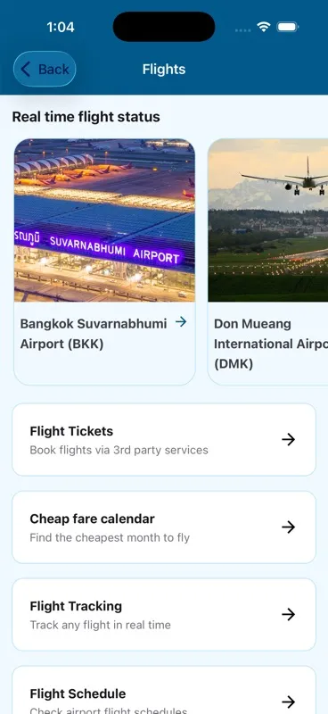
A flight isn't one task. A traveller might be checking airport context, comparing tickets, hunting a cheaper date, tracking a route, or confirming a schedule. MestoGo brings these into one labelled flight surface instead of expecting people to restart their search across services. The design choice underneath: lead with familiar airports and plain-language actions, then surface deeper utility only when it's needed.
FAQ
Both. MestoGo is a solo, end-to-end delivery. I designed the product and wrote the code that ships — the multi-region React Native app, the Firebase backend, the AI services, the fare engine, analytics, and monetization. The app is live on the App Store, so the claim is verifiable rather than a portfolio assertion.
On a 0→1 product with no team to hand off to, the fastest path to a good decision is the one that doesn't cross an org chart. Owning the implementation let me make feasibility calls in the same breath as a design call, keep the system honest about what it could actually do, and ship at a cadence no design–engineering handoff could match. It made me a better designer, because every decision carried its engineering cost.
I built a data-driven product model — shared shell, country-specific content, configuration living in the database rather than the code — so that depth in one market translated into cheaper expansion rather than a parallel rebuild. I led with Thailand because it was the deepest, most legible proving ground, and used what I learned there to make Malaysia and Nepal faster to stand up.
The principle I used was: use AI where it shortens the gap between uncertainty and a useful next action. Smart Translation and the Smart Checklist Creator both serve a specific, anxious travel moment rather than existing because AI was available. I also engineered them to degrade gracefully — remote configuration, daily quotas, and provider portability — so the feature failing never breaks the core product.
I would invest earlier in a shared, cross-market content model and stricter instrumentation of the moments that matter, rather than adding markets first and consolidating later. And I would be even more disciplined about saying no to features that were impressive but didn't serve a next action. The lesson that stuck: the product question was never 'how do we build a bigger guide' — it was 'what is the right next action'.
Next
I'm open to senior product design and UX engineering roles, and selected long-term consulting — especially where design and implementation need to move as one.